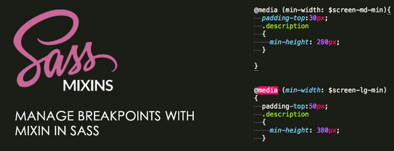
Mixin to Manage Breakpoints in SASS
In responsive website creation we to to manage several different breakpoints. In SASS you can manage those breakpoints with the help of mixin.
1. Define all breakpoints with name or label.
|
1 2 3 4 5 |
$breakpoints: ( 'small-device': ( max-width: 767px ), 'medium-device': ( max-width: 992px ), 'large-device': ( max-width: 1200px ) ) !default; |
2. Now map and respond this breakpoints.
|
1 2 3 4 5 6 7 8 9 10 11 12 13 14 15 16 17 18 19 |
// Mixin to manage responsive breakpoints // @param {String} $breakpoint - Breakpoint name // @require $breakpoints @mixin respond-to($breakpoint) { // If the key exists in the map @if map-has-key($breakpoints, $breakpoint) { // Prints a media query based on the value @media #{inspect(map-get($breakpoints, $breakpoint))} { @content; } } // If the key doesn't exist in the map show this message @else { @warn "Unfortunately, no value could be retrieved from `#{$breakpoint}`. " + "Available breakpoints are: #{map-keys($breakpoints)}."; } } |
3. Using in your SCSS Style file
|
1 2 3 4 5 6 7 |
.selector { padding;20px 0px; @include respond-to('small') { padding 0px; } } |
4. Result/Compiled css output
|
1 2 3 4 5 6 7 8 |
.selector { padding:20px 0px; } @media (max-width: 767px) { .selector { padding:0px; } } |
[paypal-donation]


