
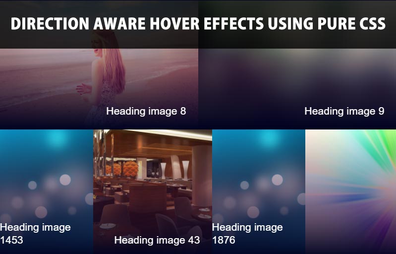
Justified Photo Grid Gallery With Pure CSS
Responsive Justified Photo Grid Gallery With Pure CSS is, flexible CSS which lets you create responsive, justified grid gallery layout for showcasing your photos. It based on CSS3 flexbox property and fully customization via CSS.
HTML
|
1 2 3 4 5 6 7 8 9 10 11 |
<div class="containerw3 containerw3-margin"> <a href="#"> <img src="image1.jpg" /> </a> <a href="#"> <img src="image2.jpg" /> </a> <a href="#"> <img src="image3.jpg" /> </a> </div |
CSS
|
1 2 3 4 5 6 7 8 9 10 11 12 13 14 15 16 17 18 19 20 21 22 23 24 25 26 27 28 29 |
.containerw3 { display: flex; overflow: hidden; flex-wrap: wrap; margin: -2.5px; } .containerw3:after { content: ''; flex-grow: 999999999; min-width: 300px; height: 0; } .containerw3 > * { position: relative; display: block; height: 300px; margin: 2.5px; flex-grow: 1; } .containerw3 > * > img { height: 300px; object-fit: cover; max-width: 100%; min-width: 100%; vertical-align: bottom; } .containerw3.containerw3-margin { margin: 2.5px; } |
[paypal-donation]


