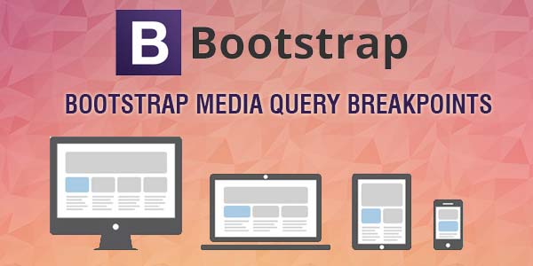
Bootstrap 3 Breakpoints and Media Queries
Here is the default sizes for Twitter Bootstrap 3 media queries, Bootstrap provides media query breakpoints in two ways.
- Mobile First Method
- Desktop First Method
The Mobile First Method is based on ‘min-width’ breakpoints concept, while Desktop First Method is based on ‘max-width’ breakpoints.
Min-Width: Refers to everything greater than or equal to the amount given.
Max-Width: Refers to everything less than or equal to the amount given.
Here are the both methods standard breakpoints for Bootstrap 3 Media Queries.
1. Non-Mobile First Method or Desktop First Method for Bootstrap 3
|
1 2 3 4 5 6 7 8 9 10 11 12 13 14 15 16 17 18 19 20 21 |
/*========== Non-Mobile First Method ==========*/ /* Large Devices & Wide Screens */ @media only screen and (max-width : 1200px) { } /* Medium Devices & Desktops */ @media only screen and (max-width : 992px) { } /* Small Devices & Tablets */ @media only screen and (max-width : 768px) { } /* Extra Small Devices & Phones */ @media only screen and (max-width : 480px) { } /* Custom, iPhone Retina */ @media only screen and (max-width : 320px) { } |
2. Mobile First Method for Bootstrap 3
|
1 2 3 4 5 6 7 8 9 10 11 12 13 14 15 16 17 18 19 20 21 |
/*========== Mobile First Method ==========*/ /* Custom & iPhone Retina */ @media only screen and (min-width : 320px) { } /* Extra Small Devices & Phones */ @media only screen and (min-width : 480px) { } /* Small Devices & Tablets */ @media only screen and (min-width : 768px) { } /* Medium Devices & Desktops */ @media only screen and (min-width : 992px) { } /* Large Devices & Wide Screens */ @media only screen and (min-width : 1200px) { } |
[paypal-donation]


