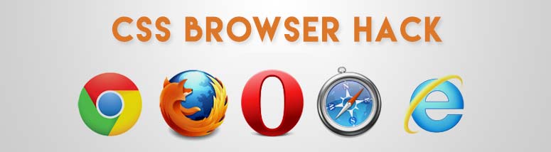
Browser Specific CSS Only
As a UI Developer i prefer trying to write common CSS that work or render same on most of browser and their different version. but when your Device or Browser target area is huge, you may need to fix specific problem on specific browser. In this case we all need to write browser hack that can target on specific browser.
A Browser specific CSS hack can be a Selector, Media Query or certain syntax construction that is recognized or render by only by a certain Browser.
In order to add a specific rule of CSS for a certain Browser, perform the following:
Chrome
|
1 |
.selector:not(*:root) {} |
|
1 |
@supports (-webkit-appearance:none) {} |
|
1 2 |
.selector { (;property: value;); } .selector { [;property: value;]; } |
|
1 |
@media \\0 screen {} |
|
1 2 3 |
@media all and (-webkit-min-device-pixel-ratio:0) and (min-resolution: .001dpcm) { .selector {} } |
Firefox
|
1 2 3 4 5 |
@media all and (min--moz-device-pixel-ratio:0) and (min-resolution: .001dpcm) {} @media all and (-moz-images-in-menus:0) and (min-resolution: .001dpcm) {} |
|
1 2 3 4 5 |
@media all and (min--moz-device-pixel-ratio:0) { @media (min-width: 0px) {} } @media all and (-moz-images-in-menus:0) { @media (min-width: 0px) {} } |
|
1 |
@supports (-moz-appearance:meterbar) {} |
|
1 |
_::-moz-range-track, body:last-child .selector {} |
|
1 |
@supports (-moz-appearance:meterbar) and (display:flex) {} |
|
1 |
@supports (-moz-appearance:meterbar) and (cursor:zoom-in) {} |
|
1 |
@supports (-moz-appearance:meterbar) and (background-attachment:local) {} |
|
1 |
@supports (-moz-appearance:meterbar) and (image-orientation:90deg) {} |
|
1 |
@supports (-moz-appearance:meterbar) and (all:initial) {} |
|
1 |
@supports (-moz-appearance:meterbar) and (list-style-type:japanese-formal) {} |
|
1 2 |
@media all and (min--moz-device-pixel-ratio:0) and (min-resolution: 3e1dpcm) {} |
|
1 2 |
@supports (-moz-appearance:meterbar) and (background-blend-mode:difference,normal) {} |
|
1 |
_:-moz-tree-row(hover), .selector {} |
Internet explorer & edge
|
1 |
@supports (-webkit-appearance:none) {} |
|
1 |
@media screen\9 {} |
|
1 |
@media \0screen\,screen\9 {} |
|
1 |
@media \0screen {} |
|
1 |
@media screen and (min-width:0\0) {} |
|
1 |
_:-ms-input-placeholder, :root .selector {} |
|
1 |
@media screen { @media (min-width: 0px) {} } |
|
1 2 3 4 |
<!--[if IE 6]> Internet Explorer 6 <![endif]--> <!--[if IE 7]> Internet Explorer 7 <![endif]--> <!--[if IE 8]> Internet Explorer 8 <![endif]--> <!--[if IE 9]> Internet Explorer 9 <![endif]--> |
|
1 2 3 4 |
<!--[if lte IE 6]> Internet Explorer 6 or less <![endif]--> <!--[if lte IE 7]> Internet Explorer 7 or less <![endif]--> <!--[if lte IE 8]> Internet Explorer 8 or less <![endif]--> <!--[if lte IE 9]> Internet Explorer 9 or less <![endif]--> |
|
1 2 3 4 |
<!--[if gte IE 6]> Internet Explorer 6 or greater <![endif]--> <!--[if gte IE 7]> Internet Explorer 7 or greater <![endif]--> <!--[if gte IE 8]> Internet Explorer 8 or greater <![endif]--> <!--[if gte IE 9]> Internet Explorer 9 or greater <![endif]--> |
|
1 |
<!--[if IE]> Internet Explorer 9- <![endif]--> |
[paypal-donation]


